ChartGen AI Reviews:AI Data Visualization Tools
About ChartGen AI
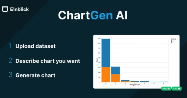
ChartGen AI lets you instantly create beautiful charts and graphs from your data for free with simple text prompts. Just upload your dataset (supports CSV/Excel/JSON data), describe the visualization you want in a sentence, and ChartGen AI will generate it for you. No need to do any manual chart creation or data wrangling!
With ChartGen AI you can create beautiful charts and graphs from your data using as little as one sentence.
About Einblick
Einblick is an AI-native data science platform that provides data teams with an agile workflow to swiftly explore data, build predictive models, and deploy data apps. Founded in 2020, Einblick was developed based on six years of research at MIT and Brown University. Einblick is funded by Amplify Partners, Flybridge, Samsung Next, Dell Technologies Capital, and Intel Capital.
Einblick is a modern data science platform that allows data scientists to swiftly explore data, build predictive models, and deploy data apps in concert with stakeholders.
How to use ChartGen AI?
Step 1: Upload Data
You can either upload your dataset or link to a Google Sheet. No need for complex data preparation or formatting.
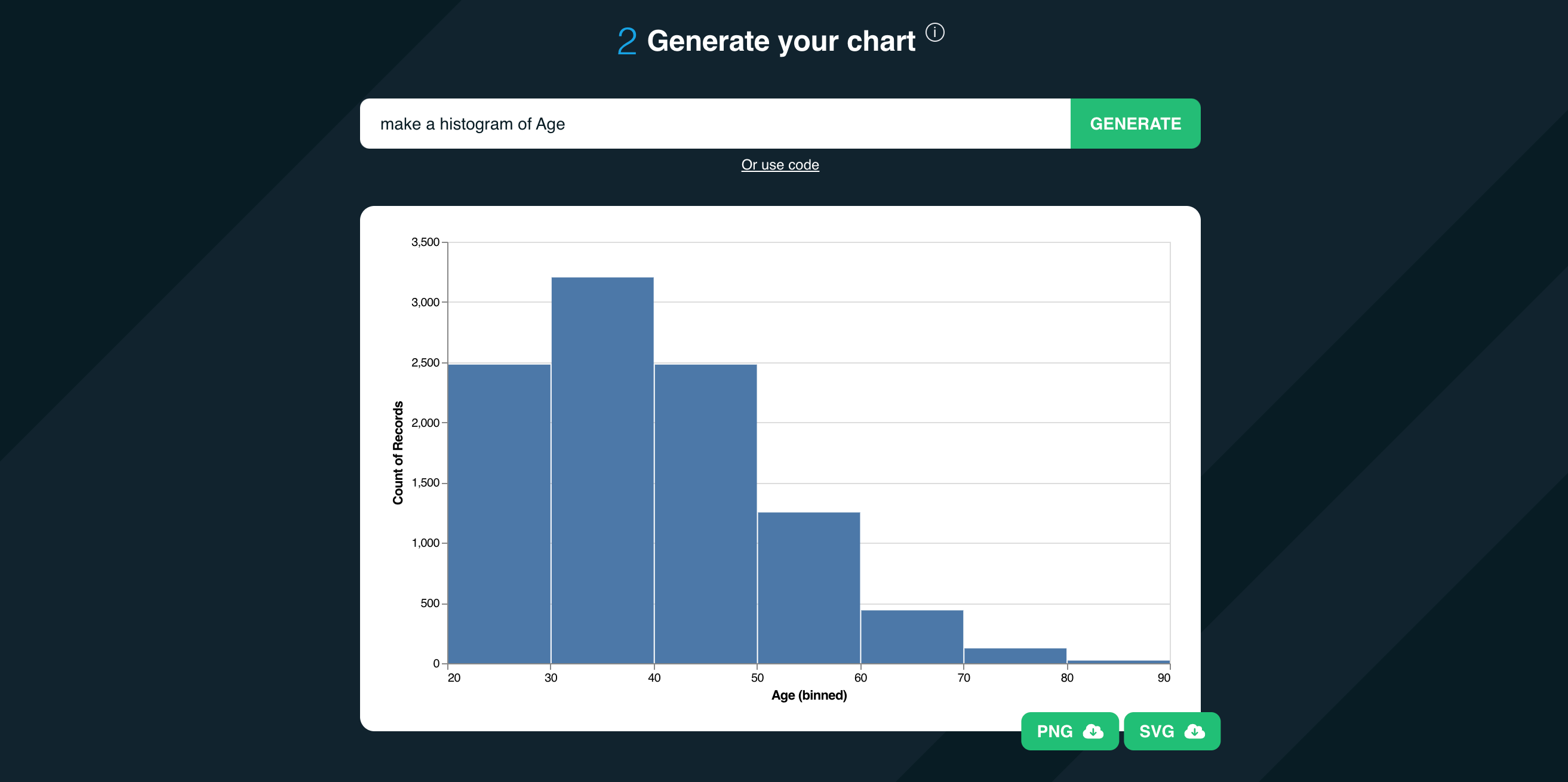
Step 2: Describe Your Chart
Describe the chart you want in natural language. For example, “Create a pie chart of col_1” or “Plot a histogram of col_2.”
Step 3: Generate Chart
Click “Generate.” That’s it! In just three straightforward steps, you’ll have your chart ready for download as either a PNG or an SVG. If you want to tweak your chart’s appearance, simply add details to your prompt. For instance, “Use a pastel color palette” or “Make the axis labels bigger.”
Like AI-powered data analytics? Try the Einblick platform for free to unlock the power of solving every data workflow with AI conversation.
Why ChartGen AI
Saving Time and Boosting Productivity
Forget about dealing with finicky pivot tables, or hundreds of toggles, options, and sliders in traditional BI tools like Excel and Tableau. With ChartGen AI, you can directly upload your dataset or link to a Google Sheet, and get straight to chart creation. ChartGen AI offers customization at your fingertips. Want a specific color palette or more bins in your histogram? Just add a few words to your prompt, and ChartGen AI adapts accordingly.
Rapid Results without Data Preprocessing
ChartGen AI delivers charts in seconds. With ChartGen AI, you can directly upload your dataset or link to a Google Sheet. Say goodbye to data preprocessing, forget about dealing with finicky pivot tables, and get straight to chart creation.
Leverage Generative AI for Impact
Generative AI can be used in a variety of applications, but the space of AI charting is particularly appealing. After all, before you can create a chart, you have to know what it should look like–you have to be able to describe it. It is at this point in the process that ChartGen AI intervenes, and allows you to create visualizations faster than ever before.
Accessibility for All
ChartGen AI democratizes data visualization. It’s user-friendly, making it accessible to those without advanced technical skills, while benefiting those who have the technical skills, but lack the time resources.
AI Data Visualization
If you try out ChartGen AI, drop us a line! We love feedback. It’s how we grow, and improve as a company.
Sample Prompts
ChartGen AI can create and modify different kinds of charts so that you can explore relationships between variables in your data, and ultimately extract meaningful insights. Try some of the following:
Create different kinds of charts and graphs
- “Create a pie chart of col_1”
- “Plot a histogram of col_2”
- “Create a box plot of col_3”
Explore relationships between variables
- “Plot the distribution of col_1, color by col_4”
- “Create a scatter plot of col_1 vs. col_2, color by col_4.”
- “Create a grid of plots of col_1 vs. col_2, divide by col_4.”
Customize your histogram
- “…using a pastel color palette.”
- “…use 20 bins.”
- “…make the axis labels bigger.”